
Case Study
- Client: Snowball – a business platform that aids businesses with capital, hands-on-managements or talent.
- Business problem: Client has 3 areas of focus which needed to be addressed effectively to their targeted audiences while differentiating from competition.
- Objective: Create a user centered website that would promote the Snowball brand in a unique way combining communication directed to three audience types.
- Main challenge: Aside from complex UI and development, the main challenge was information architecture and just condensing, simplifying the information complexity, as at first the scope was to make a multi-paged website, but after high-fidelity wireframes were delivered, the stakeholders changed the scope to a one-page website.
- Team: Me as UX Designer and Web Developer, Chief E-Commerce officer, Digital Marketing Strategist, Business Strategist, Copywriter.
- The Approach: Mix of D’Schools’ design thinking and & GV’s design sprint. Iterative information architecture. Qualitative and quantitative user research:
- For data gathering: secondary research, workshops, interviews, A/B testing
- For data analysis: thematic & content analysis, affinity diagramming, persona development, journey & flow mapping, storyboarding.
- Main user-centered problems found and fought: When dealing with multiple differentiating audiences on a single channel – it is easy to miss the point, loose the attention of visitors or even cause a cognitive overload. All this can be avoided by progressive disclosure and good storytelling (both linguistic and visual).
- Key takeaways:
- “Do this by doing this” – is a wonderful framework for writing actionable heading copy.
- When the website experience is unique an satisfactory – people who aren’t even interested in the service will spend their time exploring the website.
- Tools used: Figma, WordPress, Elementor Pro, DIY testing system made on WordPress.
In detail:
1. EMOTIONAL AND VALUE FOUNDATIONS
After the first meeting with Snowball, I did a market and competitor analysis, I looked into the material sent to me, but I also sent a questionnaire to the company itself to help identify the archetype – the fundamental category of the emotional and value meanings of the brand, like a Platonic idea. Archetypes, like the collective unconscious, are part of the work of my favourite analytical psychologist, Carl G. Jung, which I will write about some other time. Well, in the case of Snowball, the archetypes of the Creator and the Explorer have played out.
*//Of course, this is one-sided, because in this way the company will be trying to evoke the affective states of the archetype that represents it for its audience, and thus establish a more subtle connection. The communication situation would be more complete if we carried out an archetypal analysis of the audience. The meaning of this process can be better illustrated by the image below, which is a framework by M. Mark & C. S. Pearson, 2001, which places 12 brand archetypes into 4 essential categories from which they differentiate themselves. Thus, in principle, the developer needs stability and the researcher needs independence
//*

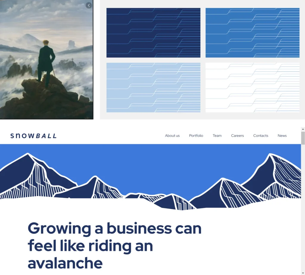
The archetype of the explorer is an individualistic and independent personality who values autonomy and independence more than belonging to a group. Explorers thrive in vast, open spaces, such as mountains and the open air, seeking to conquer the unbounded and the hard to reach. The archetype derives from C.D. Friedrich’s painting The Wanderer over the Sea of Fog, which symbolises the explorer’s desire to transcend the boundaries of the external and internal worlds and to discover new spaces.
Explorers fear stagnation and conformity, and their greatest desire is to achieve freedom and individualisation. However, they can get stuck in aimless wanderings and suffer from inner emptiness. The Explorer brand serves as a fulcrum in the customer’s explorer’s journey, helping them to achieve their goals and fulfil their subconscious desire to become. The brand may use imagery such as spirals, which anthropologists associate with the explorer’s quest for personal growth and transformation.
The archetype of the creator brand is the person who seeks to structure experience into artistic forms that give a sense of control and authenticity. Creators are cultural innovators who, through their art and inventions, can change society and the world, while also creating what is beautiful. They are driven by a curious soul and their creativity comes from the depths of their being.
Creators take innovative approaches and methods in their efforts to develop new products, marketing or entire organisations. They are known as natural leaders who shape the way things are done. According to anthropologists, people with a strong stability orientation are generally attracted to shapes that are square, so developers can use square shapes and designs to appeal to this audience.
The ultimate goal of the Creator is to give form to his vision, turning chaos into order and ideas into tangible creations. The process may start small, like a snowball, but it may eventually grow into something significant that will change the world.
2. BRAND NARRATIVE ON THE WEBSITE
As I was preparing for my second interview with Snowball, Caspar David Friedrich’s painting “Wanderer above the sea of fog”, with its whole romantic-era motif of journeys to unknown lands and the struggle with oneself and with nature, came to mind, and when I went back to the company’s branded book (the 4-colour pattern below has become the highlight of the illustration), I had an epiphany – we’re going to go up to the mountains, I said, with our proposals. Everyone was a little surprised, if not a little annoyed – are we going to be another tech company with a mountain on the cover? We won’t be, I say, because this whole visual world will be like a Snowball story. When it comes to archetypes, brand meanings and other subtle things, I’ve worked out the existential goal for all further Snowball communication – “to give shape to the vision, or from snow to snowball “
3. FINDING OUT WHO THE ADDRESSEE IS
As one of several corporate communication tools, the new website must have its own target audience. In the case of Snowball, this includes investors, companies and job seekers. But so what?
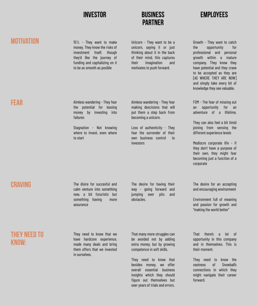
4. MOTIVATIONS, FEARS & DESIRES OF THE RECIPIENTS
Empathy is at the heart of UX design, which involves understanding a user’s human needs, motivations and pain points so that the browsing experience we create is in line with their internal preferences. Interviewing those who work with audience groups has helped us to extract the initial attitudes that enable us to form meaningful arguments and ask the big questions: will Group A trust us and invest together? – which we translate into action-oriented questions: what do we need to do to get Group A to trust us and invest together?
5. THE END IS THE BEGINNING OF THE PROPOSAL
It is important to have a goal in communication, which can actually be a process – so a combination of different stories at micro and macro level. For each audience group, we prepared a macro pathway that consisted of:
Start -> Initiation -> Peak -> End.
The beginning of everything may be an accidental discovery of Snowball or a recommendation, but we already have an idea of where in the flow of events a visit to the website will occur; the Initiation is the first contact and the reciprocal relationship with Snowball, the preparations for the transformation; the Surface is the essential step of investing your time or money, “becoming one” with Snowball; the End is the fruits of this process: the emotions that come with the fulfilment of expectations.
The ultimate goal of investors : to make a lot of money safely;
For companies, the ultimate goal : to become unicorns;
For job-seekers: to achieve individuality.
6. FROM TEXT TO VISUAL
Taking everything into account, I started the design drawings purely with the text, which I coordinated with the company’s copywriter – giving her suggestions rather than specific and “necessary” phrases. My position in this project is not to be a full-fledged judge – but a mediator, a go-between. In the process of fine-tuning the text and drawing out the first value phrases, I started to draw the sketches of the website in parallel.
What was unusual about this project was that once the text appeared, I used a video creation method – stills – to create the visual environment of the website as a coherent story. Below are the sketches and some final versions. And as you can see on the snowball.team website – all the illustrations bring together the path between the highest peak and the wooded valley below.

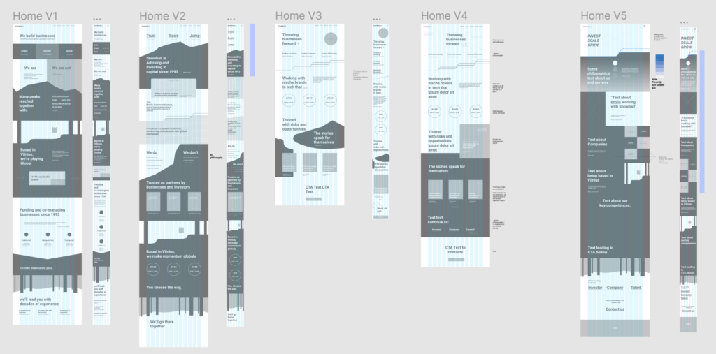
7. LOW FIDELITY WIREFRAMES
I moved from sketches on paper to Figma [which I was already using with Snowball as the project’s information centre]. Together with Snowball, we have made a lot of these versions for different pages. We did a test of the homepage inside the company.
8. TESTING
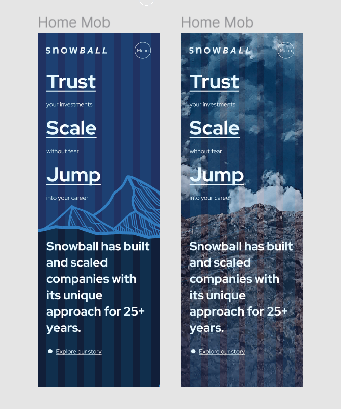
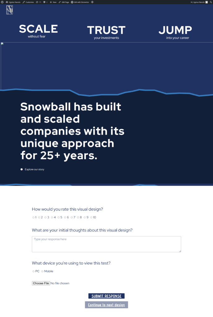
Being able to create not only designs, but also the web sites themselves – I created several tests to check the clarity of existing low-fidelity drawings for the visitor, and high-fidelity design options. The adjacent images show several page variations from the test comparing vector illustrations with photos, and a screenshot of a test page that survives today. I collected quantitative and qualitative data for the tests, the methods are quite rudimentary, but provide insights into general attitudes on the part of potential visitors.
9. ILLUSTRATIONS AND ANIMATIONS
“It can cost a lot to get a camera to shoot the scene you want – you can save a lot of money by drawing and animating everything, and you can have a lot more influence on the final result: you can decorate a whole city with your brand”- this long sentence has been with me since I started working in an animation studio. The point of all illustrations is to complement a linguistic statement with an unexpected visual example. Below is an illustration that didn’t make it onto the website.

10. HIGH FIDELITY PHASE - OR "REJECT EVERYTHING"
At this stage, there is a slight departure from the standard – the high fidelity designs were started while the text was still evolving. We agreed on the structure of the pages and that only the way things are named in the elements will change – let’s do it. Looking at the comments in Figma today, I am struck by the same wonder of insight that came to us then:
– but is all this necessary?
So much text and so much time is spent on tiny details that, admittedly, will probably be read by a minority. Remembering the aim at the beginning of the work – to give form to the vision – one might ask: what does order out of chaos look like?

or

order is that which is fleshed out from the infinity of potential to tangible and orderly differentiated elements. What we have been doing has become an example of extreme radical order, where one tries to write down everything that is, so that what is actually in order of priority is not necessarily meaningful and useful. We are getting tired and wasting time, and the chaos and uncertainty is not getting any less. So we decided to drop everything and make one maximally specific but not boring page to replace a bunch of other half-finished ones – thus getting the site out there faster. Let’s move to agile.
11. DEVELOPMENT
A website that adapts to different devices and screens is the market standard for quality, but it can be a major headache, especially when the dynamic text size is complemented by scrolling layers of illustrations, animations and additional tabs opening up.
I made the site on the WordPress platform with the Elementor Pro tool, but quite a lot of the elements needed additional code, sometimes changing them away from their original function – e.g. the drop-down screen of the discover more button is a toggle element. A lot of attention was also paid to the animations of the various interactions – to make everything that can be clicked move and change colour.
Some last words
The project impressed me, first of all because of the creative freedom in the design and the requirements for its execution, which I set myself with all the free ideas I had. The result is a small, maybe even modest, website that captures the rich world of Snowball. Obviously, sites full of images and movement like this require more load time, but I think it’s just a matter of keeping the basic rules in mind and taking care of things like letting the visitor know that the site is loading.